Outcome
I launched the Creator Design System (CDS), a growing set of tokens and components that build on WPDS foundations and unify newsroom tooling at The Post. I also established a WPDS council to balance centralized and federated design system work for both libraries, and evolve The Post's design language across news, brand, and tooling.
The WPDS team plans and facilitates component sprints to collaboratively define scope and design direction for new components. As design lead, I prioritize the component work, support Senior Product Designer Viviancess Kue in facilitating the session, and guide her through concepting and refinement—all while keeping scope and goals in mind. Sprints bring together design, engineering, product and news partners to capture a wide range of use cases and ideas.

To kick start the Creator Design System (CDS), I establishing a monthly inventory session to identify common but inconsistent design patterns across Creator Tools and unify them. As a new branch of WPDS, we needed to work hard to garner support from product and engineering for our component work. This inventory process enabled us to document components and furniture patterns in a Figma library that unified the design language across tools and paved the way for CDS implementation.

I established design system councils to empower designers and engineers from other product areas to contribute, support, and learn more about our initiatives. A mixed approach of centralized and federated work enabled our design system to grow by:

The CDS toast component builds on existing foundations in WPDS—applying semantic colors and icons to a stronger notification system.
First, we audited all varied styles and behaviors for toasts, messages, and alert components across our tools. We documented what worked—and didn't—from current solutions, and noted nested foundations that applied to the new component.

I prioritized component designs alongside an existing project to maintain momentum and ease designers' bandwidth. I supported Sr. Staff Product Designer Patrick Slawinski through pressure testing, feedback and refinement for the toast.
We published the final component to the CDS UI Kit in Figma. Our UI Kit currently includes: layer, typography, and semantic color tokens; avatar, button, chips, inputs, option menu, sidebar shell, and toast components; and global navigation, drawer, story card, and modal tool furniture.

We defined semantic tokens in the CDS to establish clear color usage across all container and component states. These tokens build on WPDS color foundations and follow a tier 2 naming pattern of cds-colors-[roleEmphasisState].

Implementation
To move designed components across the finish line into code, we established a bi-weekly CDS council meeting with engineer representatives from each tool. These council meetings fostered shared ownership for the design system and helped gain product support.
We created a shared repo, starting with semantic tokens and toast component, for all engineering teams to utilize. This repo and our Figma libraries have increased efficiency, elevated visual language, and improved cohesion across tooling projects. Leading this effort honed my systems thinking skills and technical design system knowledge.
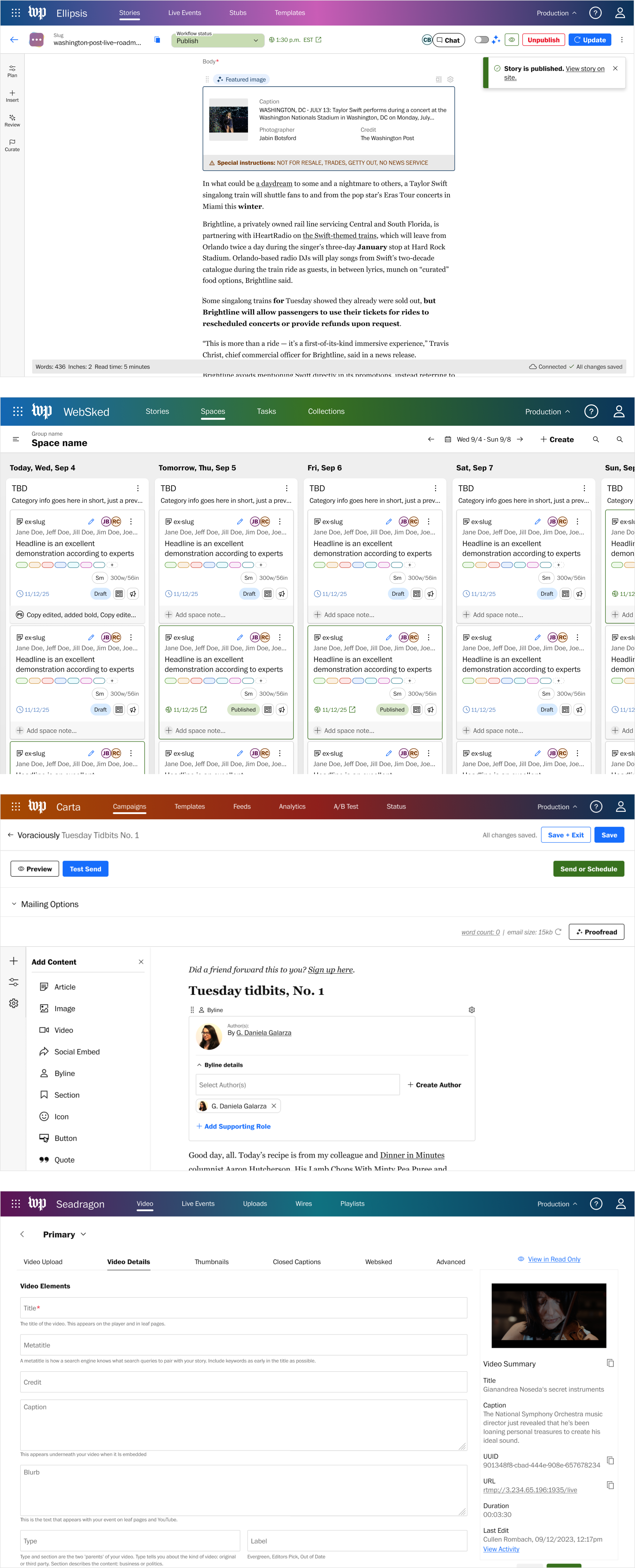
The designs below showcase how Creator teams have implemented color tokens, toast messages, and buttons across various tools.

In Q1 2025, I oversaw the launch of Dark Mode across WashingtonPost.com. Dark mode dynamically maps color tokens across display themes to maintain contrast and accessibility standards. Dark mode was a huge milestone for WPDS, spurring internal adoption of the system and creating a more seamless user experience across devices and platforms.
My experience with CDS semantic tokens was a huge asset for launching Dark Mode, enabling me to lead communications for compliance and advise on color values for new alpha tokens.
